однотипные деф баннеры(3D)(ПОЛНОСТЬЮ СОЗДАНЫ С ИИ)

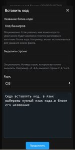
CSS:
.userBanner {
    display: inline-block;
    padding: 8px 24px;
    border-radius: 30px;
    font-family: 'Inter', 'Segoe UI', sans-serif;
    font-weight: 800;
    font-size: 12px;
    text-transform: uppercase;
    letter-spacing: 1.5px;
    text-align: center;
    color: #FFFFFF;
    position: relative;
    background: linear-gradient(135deg, #2c2c2c 0%, #1a1a1a 100%);
    box-shadow: 0 8px 0 rgba(0, 0, 0, 0.3), 0 10px 20px rgba(0, 0, 0, 0.2), inset 0 1px 0 rgba(255, 255, 255, 0.15);
    transition: all 0.1s ease;
}

.userBanner::before {
    content: '';
    position: absolute;
    top: 0;
    left: 10%;
    width: 80%;
    height: 35%;
    background: linear-gradient(135deg, rgba(255, 255, 255, 0.25) 0%, rgba(255, 255, 255, 0.05) 100%);
    border-radius: 30px 30px 0 0;
    pointer-events: none;
}

.userBanner::after {
    content: '';
    position: absolute;
    bottom: 0;
    left: 0;
    width: 100%;
    height: 40%;
    background: linear-gradient(0deg, rgba(0, 0, 0, 0.2) 0%, rgba(0, 0, 0, 0) 100%);
    border-radius: 0 0 30px 30px;
    pointer-events: none;
}

.userBanner:hover {
    transform: translateY(-2px);
    box-shadow: 0 10px 0 rgba(0, 0, 0, 0.3), 0 15px 25px rgba(0, 0, 0, 0.25), inset 0 1px 0 rgba(255, 255, 255, 0.2);
}

.userBanner:active {
    transform: translateY(4px);
    box-shadow: 0 4px 0 rgba(0, 0, 0, 0.3), 0 8px 15px rgba(0, 0, 0, 0.2);
}

.userBanner.red,
.userBanner.blue,
.userBanner.green,
.userBanner.yellow,
.userBanner.gold,
.userBanner.userBanner--staff,
.userBanner.userBanner--admin,
.userBanner.userBanner--moderator {
    background: linear-gradient(135deg, #2c2c2c 0%, #1a1a1a 100%);
    box-shadow: 0 8px 0 rgba(0, 0, 0, 0.3), 0 10px 20px rgba(0, 0, 0, 0.2), inset 0 1px 0 rgba(255, 255, 255, 0.15);
}
Последнее редактирование модератором:


