- Ноя
- 107
- 24
Пользователь
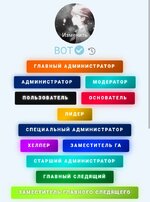
Приветствую вас в данной теме сливаю вам анимированные баннеры.
Скриншоты;
Скриншоты;
Less:@keyframes move_lava { 0% { background-position: 0% 50% } 50% { background-position: 100% 50% } 100% { background-position: 0% 50% } } @keyframes move_green { 0% { background-position: 0% 50% } 50% { background-position: 100% 50% } 100% { background-position: 0% 50% } } @keyframes move_blue { 0% { background-position: 0% 50% } 50% { background-position: 100% 50% } 100% { background-position: 0% 50% } } .glav_adm, .admin, .st_admin, .zga, .ga, .spec_adm, .moder, .glav_sled, .zam_sled, .helper, .leader, .user, .osnovatel, .polzovatel, .starshiy_admin, .specialniy_admin, .glavniy_sledyaschiy, .zam_glavnogo_sledyaschego, .osnov { display: inline-block; font-weight: 900; font-size: 11px; text-transform: uppercase; letter-spacing: 2px; padding: 7px 18px; margin: 4px; border-radius: 3px; border: none; text-align: center; color: #ffffff !important; background-size: 300% 300%; } .osnov, .glav_adm, .osnovatel { background-image: linear-gradient(135deg, #cc002b, #ff003c, #590012, #cc002b) !important; box-shadow: 0 0 15px rgba(255, 0, 60, 0.6); text-shadow: 0 0 5px #ff003c; animation: move_lava 4s ease infinite; } .zga { background-image: linear-gradient(135deg, #001166, #0033ff, #000022, #001166) !important; box-shadow: 0 0 15px rgba(0, 51, 255, 0.8); text-shadow: 0 0 6px #0033ff; animation: move_blue 4s ease infinite; } .admin { background-image: linear-gradient(135deg, #001a4d, #002d80, #000d26, #001a4d) !important; box-shadow: 0 0 10px rgba(0, 45, 128, 0.6); text-shadow: 0 0 5px #002d80; animation: move_blue 4s ease infinite; } .st_admin, .starshiy_admin { background-image: linear-gradient(135deg, #008080, #00eee7, #004d4a, #008080) !important; box-shadow: 0 0 15px rgba(0, 238, 231, 0.6); text-shadow: 0 0 5px #00eee7; animation: move_blue 4s ease infinite; } .spec_adm, .specialniy_admin { background-image: linear-gradient(135deg, #4a00e0, #8e2de2, #240046, #4a00e0) !important; box-shadow: 0 0 15px rgba(142, 45, 226, 0.7); text-shadow: 0 0 5px #8e2de2; animation: move_lava 5s ease infinite; } .ga { background-image: linear-gradient(135deg, #e64a00, #ff6a00, #591d00, #e64a00) !important; box-shadow: 0 0 15px rgba(255, 106, 0, 0.6); text-shadow: 0 0 5px #ff6a00; animation: move_lava 4s ease infinite; } .glav_sled, .glavniy_sledyaschiy { background-image: linear-gradient(135deg, #004d1a, #009933, #001a09, #004d1a) !important; box-shadow: 0 0 15px rgba(0, 153, 51, 0.7); text-shadow: 0 0 5px #00ff66; animation: move_green 4s ease infinite; } .zam_sled, .zam_glavnogo_sledyaschego { background-image: linear-gradient(135deg, #7cfc00, #adff2f, #3a5f0b, #7cfc00) !important; box-shadow: 0 0 15px rgba(173, 255, 47, 0.5); text-shadow: 0 0 4px #3a5f0b, 0 0 8px #ffffff; animation: move_green 4s ease infinite; } .moder { background-image: linear-gradient(135deg, #008080, #00ced1, #004d4d, #008080) !important; box-shadow: 0 0 15px rgba(0, 206, 209, 0.5); text-shadow: 0 0 5px #00fff7; animation: move_green 4s ease infinite; } .helper { background-image: linear-gradient(135deg, #a600ff, #cc00ff, #3c005c, #a600ff) !important; box-shadow: 0 0 15px rgba(204, 0, 255, 0.6); text-shadow: 0 0 5px #cc00ff; animation: move_lava 4s ease infinite; } .leader { background-image: linear-gradient(135deg, #d49a00, #ffbb00, #4d3800, #d49a00) !important; box-shadow: 0 0 15px rgba(255, 187, 0, 0.6); text-shadow: 0 0 5px #ffbb00; animation: move_lava 4s ease infinite; } .user, .polzovatel { background: #0f0f12 !important; border: 1px solid rgba(255, 255, 255, 0.15) !important; box-shadow: 0 0 10px rgba(255, 255, 255, 0.05); text-shadow: 0 0 4px #ffffff; }