- Ноя
- 38
- 7
Пользователь
Всем привет, сливаю префиксы тем похожие на префиксы King Russia но они немного различаются
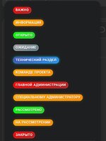
CSS:
.close {
    position: relative;
    display: inline-flex;
    align-items: center;
    justify-content: center;
    padding: 3px 6px;
    font-size: 66%;
    font-weight: 700;
    line-height: 1.2;
    text-transform: uppercase;
    letter-spacing: 0.3px;
    border: none;
    border-radius: 10px;
    text-align: center;
    overflow: hidden;
    z-index: 1;
    cursor: pointer;
    transition: all .3s cubic-bezier(.4, 0, .2, 1);
    background-size: 200% 200%;
    animation: gradientShimmer 3s ease infinite;
    color: #FFFFFF;
    text-shadow: 0 1px 1px rgba(0,0,0,0.3);
    box-shadow: inset 0 0 0 1px rgba(255,255,255,0.2),0 2px 4px rgba(0,0,0,0.15);
    background: linear-gradient(150deg, #f00, #b22222);
    box-shadow: inset 0 0 0 1px rgba(255,255,255,0.2),0 2px 4px rgba(0,0,0,0.15),0 0 6px rgba(255,0,0,0.4)
}

.consideration1 {
    position: relative;
    display: inline-flex;
    align-items: center;
    justify-content: center;
    padding: 3px 6px;
    font-size: 66%;
    font-weight: 700;
    line-height: 1.2;
    text-transform: uppercase;
    letter-spacing: 0.3px;
    border: none;
    border-radius: 10px;
    text-align: center;
    overflow: hidden;
    z-index: 1;
    cursor: pointer;
    transition: all .3s cubic-bezier(.4, 0, .2, 1);
    background-size: 200% 200%;
    animation: gradientShimmer 3s ease infinite;
    color: #FFFFFF;
    text-shadow: 0 1px 1px rgba(0,0,0,0.3);
    box-shadow: inset 0 0 0 1px rgba(255,255,255,0.2),0 2px 4px rgba(0,0,0,0.15);
    background: linear-gradient(150deg, #9e9e9e, #607d8b)
}

.tex {
    position: relative;
    display: inline-flex;
    align-items: center;
    justify-content: center;
    padding: 3px 6px;
    font-size: 66%;
    font-weight: 700;
    line-height: 1.2;
    text-transform: uppercase;
    letter-spacing: 0.3px;
    border: none;
    border-radius: 10px;
    text-align: center;
    overflow: hidden;
    z-index: 1;
    cursor: pointer;
    transition: all .3s cubic-bezier(.4, 0, .2, 1);
    background-size: 200% 200%;
    animation: gradientShimmer 3s ease infinite;
    color: #FFFFFF;
    text-shadow: 0 1px 1px rgba(0,0,0,0.3);
    box-shadow: inset 0 0 0 1px rgba(255,255,255,0.2),0 2px 4px rgba(0,0,0,0.15);
    background: linear-gradient(150deg, #3f51b5, #2196f3);
    box-shadow: inset 0 0 0 1px rgba(255,255,255,0.2),0 2px 4px rgba(0,0,0,0.15),0 0 6px #00bcd4
}

.open {
    position: relative;
    display: inline-flex;
    align-items: center;
    justify-content: center;
    padding: 3px 6px;
    font-size: 66%;
    font-weight: 700;
    line-height: 1.2;
    text-transform: uppercase;
    letter-spacing: 0.3px;
    border: none;
    border-radius: 10px;
    text-align: center;
    overflow: hidden;
    z-index: 1;
    cursor: pointer;
    transition: all .3s cubic-bezier(.4, 0, .2, 1);
    background-size: 200% 200%;
    animation: gradientShimmer 3s ease infinite;
    color: #FFFFFF;
    text-shadow: 0 1px 1px rgba(0,0,0,0.3);
    box-shadow: inset 0 0 0 1px rgba(255,255,255,0.2),0 2px 4px rgba(0,0,0,0.15);
    background: linear-gradient(150deg, #0f0, #32cd32);
    box-shadow: inset 0 0 0 1px rgba(255,255,255,0.2),0 2px 4px rgba(0,0,0,0.15),0 0 6px rgba(0,255,0,0.4)
}

.consideration {
    position: relative;
    display: inline-flex;
    align-items: center;
    justify-content: center;
    padding: 3px 6px;
    font-size: 66%;
    font-weight: 700;
    line-height: 1.2;
    text-transform: uppercase;
    letter-spacing: 0.3px;
    border: none;
    border-radius: 10px;
    text-align: center;
    overflow: hidden;
    z-index: 1;
    cursor: pointer;
    transition: all .3s cubic-bezier(.4, 0, .2, 1);
    background-size: 200% 200%;
    animation: gradientShimmer 3s ease infinite;
    color: #FFFFFF;
    text-shadow: 0 1px 1px rgba(0,0,0,0.3);
    box-shadow: inset 0 0 0 1px rgba(255,255,255,0.2),0 2px 4px rgba(0,0,0,0.15);
    background: linear-gradient(150deg, #ffa500, #ff8c00);
    box-shadow: inset 0 0 0 1px rgba(255,255,255,0.2),0 2px 4px rgba(0,0,0,0.15),0 0 6px rgba(255,165,0,0.4)
}

@keyframes neonPulse {
    0%,100% {
        opacity: 0.6;
        transform: scale(.9)
    }

    50% {
        opacity: 1;
        transform: scale(1.1)
    }
}